

Testing, testing. Is this thing on?
This is my first blog post on Holland Avenue Home in over a year. I’ve missed this space a lot. I’ve shared about our new Kentucky home here and there on Instagram, but my heart has always been here on the blog where I can tell you the whole story and share all the photos, you know?
There have been a few projects in our new home over the last year, but I’m sharing the first one with you today. Our English Cottage inspired office/family room combo. We’re affectionately calling it “The Snug” (a British slang term for “enjoying or affording comforting warmth and shelter especially in a small space”).
I’ve always been inspired by British design. Moving into our new home has given me an opportunity to bring character and coziness to a bland, builder-grade condo, and I’ve continually looked to English designers for inspiration. The thoughtful layers, colors, and storied souls of English cottages speak to me in a way big-box store trends just never will.
Our third bedroom functions as an office and sitting room, and for a long time it was the “leftover” room I didn’t know what to do with. We recently decided to try moving our TV to this room so that the family room downstairs can be more “analog”. I looked on Craigslist for a cheap TV stand, and thought $20 was a worthy investment for an experiment to change how our home functions. If you give a mouse a tv stand, they’re going to want fresh paint to go with it (just ask the mouse’s husband).
In almost every English home I study for inspiration, there’s usually a dreamy blue-green paint color adorning the walls. It feels like it’s always been there. I love how it makes a room feel effortless and inviting. I set out to choose an Englishy blue-green paint color that isn’t totally blue, isn’t totally green, isn’t too bright, isn’t too dark, and is practically perfect in every way. Simple.

Inspiration via Sean A. Pritchard’s Instagram


I prioritized viewing the paint colors after dark, in the lamp-lit room, since that’s when we’ll be spending the most time here. I taped my “top 24” to the wall, chose my top 5, and waited to view them in the daylight too.
Valiant Blue from Sherwin Williams at Lowe’s was the winner!
Here’s a before photo of this room. It’s the only one I have! I’m telling you, this room was the forgotten leftover space. For a house that only has six rooms, I needed this one to work harder and feel more like us.

I sold the wooden desk because it was actually a vanity, and chairs couldn’t fit comfortably in the little nook. I found a new-to-me desk on Facebook Marketplace for $60 (only $10 more than I made selling the other one!)
Ben and I spent two evenings of our Thanksgiving break painting, and we’re both amazed at how a gallon of paint and a new layout made this our new favorite room. We spent less than $100 on this refresh, and I’m happy to say it’s achieving all of my English cottage dreams!

The new-to-me yellow desk is a perfect complement to the blue walls.

Every single thing in this room is secondhand except the TV, the Mac, and the Brittany Smith Studio artwork in the tiny frame (far right of the gallery wall, pictured above). 


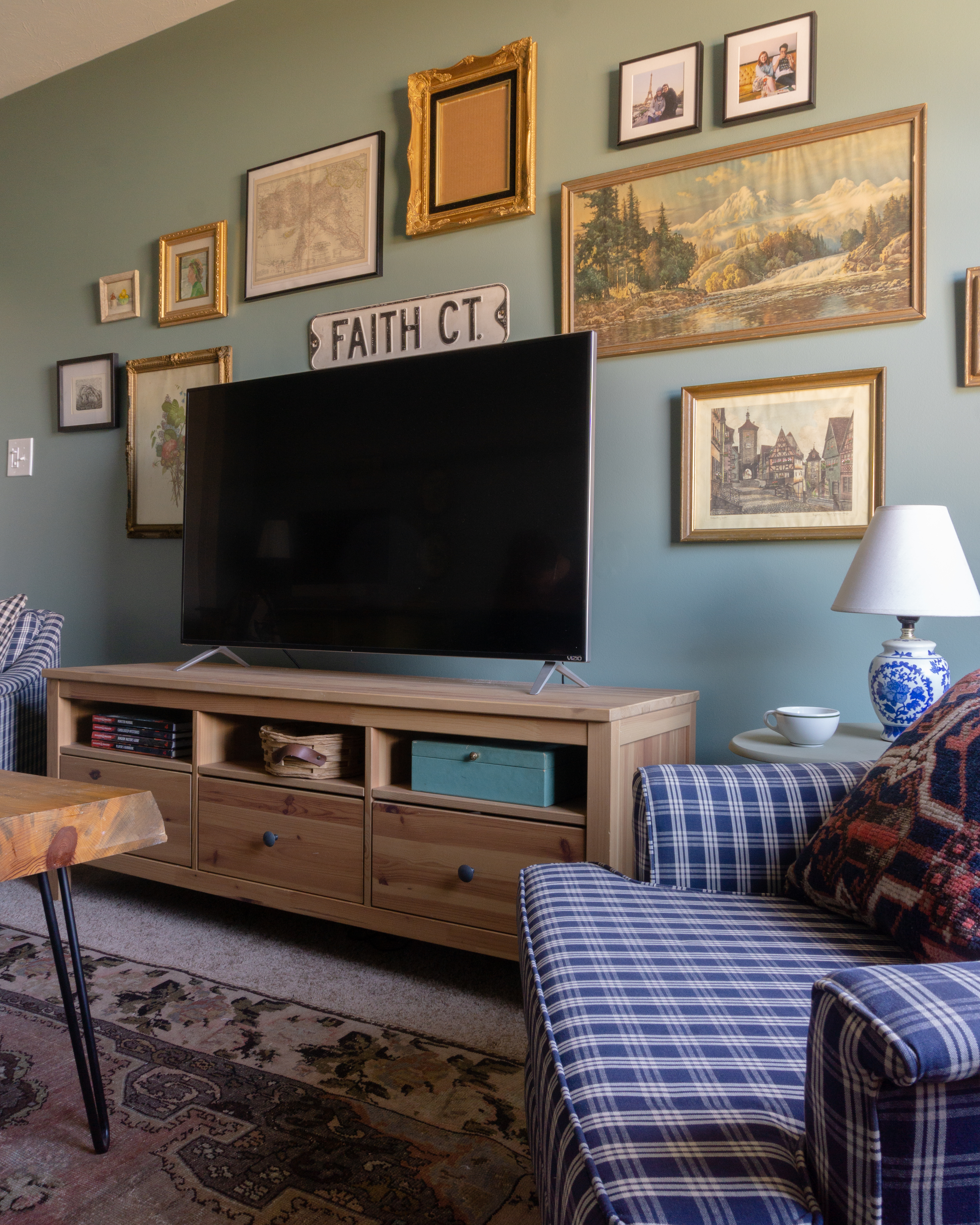
I still need to find a piece of artwork for that empty gold frame. The frame was $0.50 at a church rummage sale last month, and I couldn’t pass it up. I’m thinking a print from Maggie Linares would be perfect to tie in the other colors in the room.

The black and white bear print is a greeting card from Ben’s Oma and Opa that I framed.

That’s it! Our English inspired office/family room/snug.
Like I mentioned before, everything in this room was scored secondhand. The plaid furniture is my best Facebook Marketplace find. It was $100 for the whole set, and the sofa is a pull-out bed. We pulled it out for movie night after finishing the room, and our dogs think it’s the best idea we’ve ever had.
There was a heated debate on my Instagram about whether this paint is blue or green. And by debate, I mean over 80% of the poll results insisted it is green. I insist it’s blue-green, but the controversy tells me I chose the right color for my “not quite blue, not quite green” goal.
I hope to share more projects soon here on Holland Avenue Home. Until then, I have to know. Is it blue… or green?

Leave a Reply